In SwiftUI, creating buttons is very simple and straightforward. Button with image in SwitfUI is created using the same Button view, which we use for text-based buttons. However, instead of providing a text label, we specify an image as the label. Using this approach we can transform any desired icon or image into an interactive, tappable button.
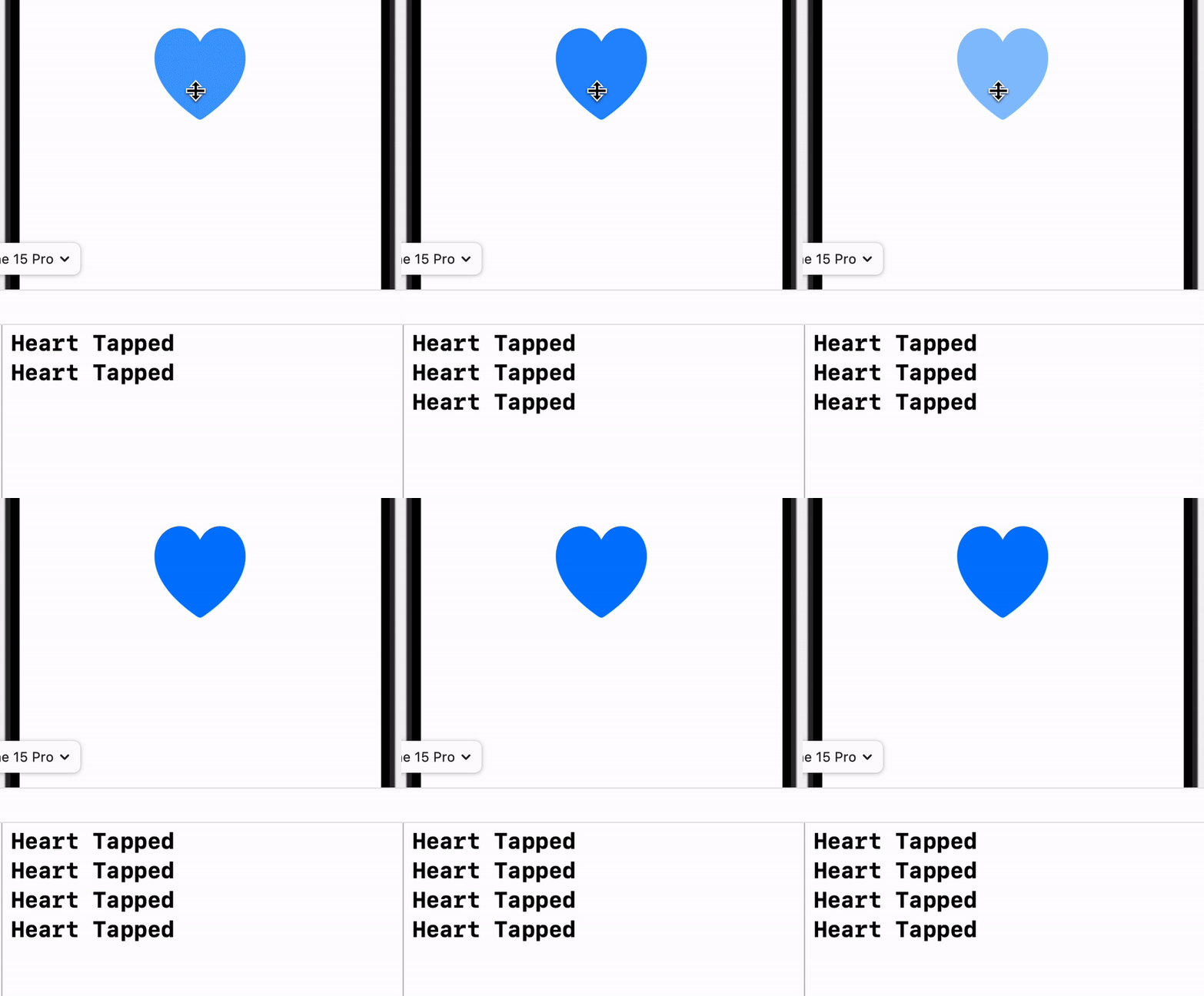
For instance we want to use system heart image as a button which prints “Heart Tapped” on its tap. We can do it using the following code snippet:
Button {
    print("Heart Tapped")
} label: {
    Image(systemName: "heart.fill")
         .resizable()
         .frame(width: 100, height: 100)
}
I have set its width and height to 100 using frame modifier after making it resizeable. Now when we click on heart it prints “Heart Tapped” on console.

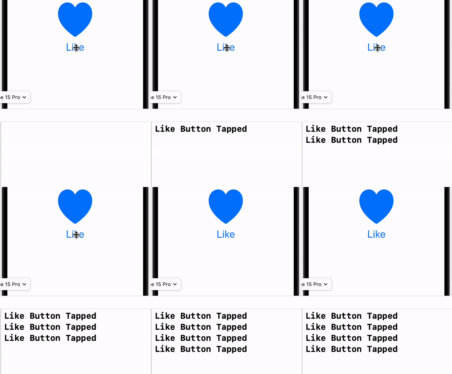
It is not necessary to add only a single view inside the label. We can add vertical or horizontal stack of views as label. Let us see how can we use vertical stack with “Heart” image and “Like” text as a label.
Button {
          print("Like Button Tapped")
       } label: {
                VStack {
                    Image(systemName: "heart.fill")
                        .resizable()
                        .frame(width: 100, height: 100)
                    Text("Like")
                        .font(.system(size: 30))
                }

       }
We saw how easy it is to create a button with image in SwiftUI we can simply set its label an “Image” view instead of a “Text” view. We can customise appearance of the button by adjusting its properties like size, padding and corner radius.
